Showing posts with label experiment. Show all posts
Showing posts with label experiment. Show all posts
Animation practice: walk cycle V1 [clean]
Made some slight corrections to the arm! I think it's a bit better now but I'm not entirely satisfied; it seems, to me, as if it goes back too far. If it went back a little less I could possibly have delayed it at its furthest point for just a little longer which would probably have looked better, but hey ho!
I also did a very quick cleaned up version:
I'm actually surprised by how it turned out — looks better than I thought it would! I forgot the head in some frames, because I am a big stupid face. The arms look a lot better in the clean version but I'm not at all sure why — I didn't change them at all?
Still, it was great practice and I feel that — looking at this compared to my early cycles — I've actually made some sort of progress and, dare I say it, I may even begin to be getting the hang of walk cycles. Which is a nice feeling. Let's hope it lasts...
1 comments
 Labels:
animation,
experiment,
flash,
practice
Labels:
animation,
experiment,
flash,
practice
Sketchbook: 19/01/2012
Didn't get nearly as much done tonight as I'd hoped, owing primarily to my mother managing to get lost twice on the way back home. Subsequently, a journey that should only have taken an hour and a half ended up taking three. Ho hum!

 Continuing my quest for perfect posing, I tried using a big red pen to very loosely capture the flow of the action through the body, giving myself more of a starting point. I then built on top of that, trying to start by looking at the tilt of the shoulders against the hips to keep things in balance. Certainly still far from perfect, but I feel like I'm beginning to understand it a little better - though I don't yet entirely feel the weight that I'm supposed to be drawing. That'll come with time I suppose.


0
comments
Labels:
action,
experiment,
practice,
reflection,
sketchbook
Sketchbook: hyenas, cats and old people
I've been wanting to keep myself busy over the break and had hoped to be able to get a head start on the next project. I've been drawing somewhat irregularly — my aim is to make a habit of it. I'm building up slowly — trying to do at least one drawing (or page of drawings) per day, which of course in the long run is nowhere near enough, but I want to get to the stage where it becomes second nature, where I don't even have to think about pulling my sketchbook out.
I had intended to start generating ideas for the next project already, before I learned that we would probably be given a list of words or themes to work from. Still, it's probably good practice to keep the ideas ticking over.
That being said, here are some doofy pages from my sketchbook from the past few days:


I didn't really take it much beyond imagining some scenarios in my head before I got distracted and started drawing cats instead.


I looked at how some other artists and animators have simplified cats for use in comic strips or animation, to better understand how the relatively complex physiology can be broken down.


I found a great little handout online discussing the anatomy of a cat for use in animation which I found really helpful, so I did some simplified drawings based on some of the examples there.

I had intended to start generating ideas for the next project already, before I learned that we would probably be given a list of words or themes to work from. Still, it's probably good practice to keep the ideas ticking over.
That being said, here are some doofy pages from my sketchbook from the past few days:


Nothing really behind these... just some doodles of hyenas. Top page was an actual exercise in observation, on the bottom is a page of doodles done whilst trying to sleep!
One of the books I got from the library gave some great suggestions on generating ideas; one was to take classic scenarios or stories and reverse character roles or insert new ones. I was just kind of messing around and turned Snow White into a disgruntled housewife who has to 'rescue' (or wake up) her oafish, sleeping husband.


I didn't really take it much beyond imagining some scenarios in my head before I got distracted and started drawing cats instead.


I looked at how some other artists and animators have simplified cats for use in comic strips or animation, to better understand how the relatively complex physiology can be broken down.

Understanding how something is built is crucial before you can start breaking it down and making it move, so I tried to get to grips with the basic anatomy of cats. They have really weird legs!

I found a great little handout online discussing the anatomy of a cat for use in animation which I found really helpful, so I did some simplified drawings based on some of the examples there.

And then some more attempts to understand how the hell their hind legs work.
I don't really know if this was headed in the right direction but it's gotten me drawing again, which is always valuable practice. I think I'm rushing myself to try and get all the stuff in my head down on paper. I need to stop that, stop the panicking and just focus on a few little things at a time.
Andy suggested that I work on keeping the energy and quality of rough drawings through to the cleaned and refined version, which is something that I'd notably struggled with in the last few projects. I'm thinking of doing some more comic strips for general drawing/ideas/storytelling practice, so it might be good to try and combine the two. The last set of comics I did suffered a lot from the 'stiff artwork' problem (and just generally looking bad) so I need to get used to being less precious and working more loosely.
0
comments
Labels:
cats,
character design,
experiment,
ideas,
people,
reflection,
sketchbook
Finest wines — version 2
Mucked around with this one a little more, not changed too much, mostly just playing with the fist slam at the end. It's still not quite right. I don't really know if it's working with the voice clip — it's not really angry enough for him to pound his fist on the table like that.
I'm going to have a look at getting some sort of character design roughed out so I can start tinkering with the mouth.
The audio quality is still horrible... can't seem to figure out what's wrong with it!
0
comments
Labels:
animation,
experiment,
flash,
lip sync
Digital Skills: Backdrop experimentation
Been doing a bit of tinkering with Photoshop, taking some inspiration from the works of Lewitt-Him and Alice/Martin Provensen. I wanted to see whether I could produce a similar effect to their simplistic cutout style using digital techniques.
Not altogether too happy with it. I'm fairly pleased with the trees and grass and general scenery, but I really lost my groove on the house, which came out horrendously. There was a lot of detail that was difficult to break down and I was starting to get really impatient with some technical issues (read: Photoshop throwing up an "unrecoverable error" at me every 10 minutes), so I ended up really rushing it!
I thought that having quite bold and simplistic backdrops could work quite well if I was to have quite detailed character puppets, helping to bring focus to the scene. I think the colours could stand to be a little more subdued. Though I used a relatively limited pallette it's almost quite garish and potentially distracting. Lowering the opacity might help as opposed to completely re-colouring the entire scene.

The image was quite simple (if a little time consuming) to create — the original image (above) was sourced from sxc.hu, a free stock image resource. Ordinarily, I would prefer to go out and source my own images to use, but for the purposes of a spontaneous experiment it didn't really seem worth a trip to Holland ;] Retrospectively I could have used almost any image but I thought I'd try and keep with the theme of the project!
 First I applied a Poster Edges filter to the image. This was to darken existing contrast boundaries and help Photoshop detect the edges of each object in the image when it came to the selection process.
 I then increased the brightness and contrast very slightly — again, to help with edge detection.
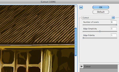 The cutout filter is one usually best avoided — in this instance, though, I found its use acceptable in order to help simplify the colours and shapes in the image, providing me a solid guideline to work from.
 I then duplicated the background layer and applied a Find Edges filter to the copy. This gave a strong, distinct outline to everything in the image.
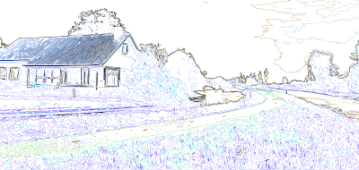
Unfortunately, in doing so, it also loses its colour information. Ideally I need the guidelines and the simplified colours/shapes from the previous layer, so I applied a Soft Light blend mode to remove the white from this layer and overlay it onto the one below.


 The result is this fairly ugly but very useful image. It contains both the outlines from find edges and the simplified colours and shapes from the cutout filter, providing a perfect guide to paint over.
 Because of the clear colour and edge distinction, I was able to simply use the magnetic lasso tool to make a loose selection around any area in the image. Photoshop was able to very accurately detect the edges of whatever I was selecting and mostly guided itself.
 I could then just fill the selection with my chosen colour.
 |
| Click for larger view |
I thought that having quite bold and simplistic backdrops could work quite well if I was to have quite detailed character puppets, helping to bring focus to the scene. I think the colours could stand to be a little more subdued. Though I used a relatively limited pallette it's almost quite garish and potentially distracting. Lowering the opacity might help as opposed to completely re-colouring the entire scene.
The image was quite simple (if a little time consuming) to create — the original image (above) was sourced from sxc.hu, a free stock image resource. Ordinarily, I would prefer to go out and source my own images to use, but for the purposes of a spontaneous experiment it didn't really seem worth a trip to Holland ;] Retrospectively I could have used almost any image but I thought I'd try and keep with the theme of the project!


Unfortunately, in doing so, it also loses its colour information. Ideally I need the guidelines and the simplified colours/shapes from the previous layer, so I applied a Soft Light blend mode to remove the white from this layer and overlay it onto the one below.


0
comments
Labels:
digital skills,
experiment,
Photoshop
Lamp impact version 2, take 2
I think I may lay this idea to rest at this point. It's punished me enough as it is... and I'm sick of lamps
0
comments
Labels:
animation,
experiment,
pencil test
Lamp impact version 2
I decided to have one last stab at the lamp idea, this time approaching it (quite literally) from another angle.

My idea this time was to have the ball come from the side and strike the lamp from the back, bouncing off and knocking it forward. I thought this might be slightly easier to accomplish and also give me an opportunity to practice a rebound from the ball hitting a vertical object.
I think it sort of works, though I think it's lacking in impact and it's a bit too quick to be fully comprehendable. Once again I need to look at adding more frames and finding a way to just extend the scene a little bit longer so that it has time to register and sink in.
0
comments
Labels:
animation,
experiment,
pencil test
Finalised-ish ball bash
Further tests to see how shooting singles as opposed to doubles would effect the animation.

It's still not really what I was going for but I wanted to test it a bit more before deciding whether to scrap it completely. I think part of the problem — aside from being pretty poorly animated in general — is the lack of visual clarity. If I were to get the ball bouncing on the lamp's head in there, it might help to provide some context that could bring it together a bit more.
I decided to just use a coin to represent the ball as this would allow me to roughly plot out the ball's movement and speed without sacrificing too much time drawing each frame.
 As always, a second version shot in singles:

In this instance, I think the faster version works a little better. Adding the ball seems to help tremendously but there are still a lot of problems with it. It's still very choppy — I certainly need some more frames on the lamp and would definitely need to spend more time on the ball. I'd need to keep an eye on the path of the ball and keep it falling and rising back up in a straight line, as well as watching the point of impact as it hits the lamp. Another stupid mistake — the coin changes sides where I wasn't paying enough attention to which face was up.
I think if I were to spend a little more time on it I would liked to have had the coin spin as it drops and flicks off the head of the lamp before it jumps back up. I'm not entirely sure where to go at this point — I may continue to work the idea from another angle or start working on something else. I'm thinking it might be best to just leave this one as it is.
It's still not really what I was going for but I wanted to test it a bit more before deciding whether to scrap it completely. I think part of the problem — aside from being pretty poorly animated in general — is the lack of visual clarity. If I were to get the ball bouncing on the lamp's head in there, it might help to provide some context that could bring it together a bit more.
I decided to just use a coin to represent the ball as this would allow me to roughly plot out the ball's movement and speed without sacrificing too much time drawing each frame.
In this instance, I think the faster version works a little better. Adding the ball seems to help tremendously but there are still a lot of problems with it. It's still very choppy — I certainly need some more frames on the lamp and would definitely need to spend more time on the ball. I'd need to keep an eye on the path of the ball and keep it falling and rising back up in a straight line, as well as watching the point of impact as it hits the lamp. Another stupid mistake — the coin changes sides where I wasn't paying enough attention to which face was up.
I think if I were to spend a little more time on it I would liked to have had the coin spin as it drops and flicks off the head of the lamp before it jumps back up. I'm not entirely sure where to go at this point — I may continue to work the idea from another angle or start working on something else. I'm thinking it might be best to just leave this one as it is.
0
comments
Labels:
animation,
experiment,
pencil test
I had a shot at simplifying the lamp's design by replacing all the springs and metal joints with a standard flexible neck. I thought this might make it a bit easier to animate him being knocked down by the ball as it has a much more straightforward range of motion than all of Luxo's moving joints.

I shot each frame quickly just to check that the animation was smooth and correct. I'm really not pleased with it at all, it seems too jumpy and it's not at all the effect I was going for. I'm trying to get his head to sort of snap downwards as the ball strikes him at quite a high velocity. I'm not sure how much of it just looks "wrong" because there's nothing else going on in the scene — I think it might look a bit better sped up and with the ball actually in place.
I might try playing around with the frame rate and adding a couple more inbetweens here and there to see if I can improve it at all.
I might try playing around with the frame rate and adding a couple more inbetweens here and there to see if I can improve it at all.
0
comments
Labels:
animation,
experiment,
pencil test
Ron showed us this fantastic little Pixar short on Monday. I felt a bit sorry for the ball though, so as I was playing around with my angry bouncing balls I thought it could be quite funny to try and have it jumping up and down on Luxo's head.

I don't really want to give up at this stage so I'll have a go at simplifying his design a little bit. I want to get rid of all those moving parts and maybe just have one long flexible neck or something.
0
comments
Labels:
animation,
experiment,
sketchbook
Aggressive ball — 4th attempt.
Variation on the previous attempt, using roughly the same timing and spacing but with a freehand ball. I also applied a little more squash and stretch to the ball as I did quite like the 'gummy' feel of earlier attempts.

Once again, I also did a slower version, but I think it loses a lot of its personality:

Once again, I also did a slower version, but I think it loses a lot of its personality:
Aggressive ball — 3rd attempt
Initially, I thought it was too fast so I lowered the frame rate very slightly to slow it down a little:

0
comments
Labels:
animation,
ball bounce,
experiment,
Photoshop
Aggressive ball — 2nd attempt

0
comments
Labels:
animation,
ball bounce,
experiment,
Photoshop
Aggressive ball — 1st attempt
Despite all promise of beer and cake, I wasn't allowed to stay in the animation studios all night, so I decided to do a bit of digital experimentation in preparation for getting something finalised finished tomorrow.
I wanted to try expressing mood through motion (that sounds very pretentious, I'm sorry) and am attempting to get a ball that bounces in an angry, aggressive manner.

I was aiming for something that kind of draws itself back in preparation before throwing itself downwards with all its weight, but it hasn't really turned out that way. It kind of just looks like it's stuck to the ceiling, falls off and floats back up again. I'm not entirely sure how to go about fixing it — if I remove too many frames I fear it may be too choppy. It's currently running at the highest frame rate possible (for Photoshop anyway), so whether it would be different in Dragon, I don't know.
I'm going to have another shot at it and see if I can speed up the drop at all.
I wanted to try expressing mood through motion (that sounds very pretentious, I'm sorry) and am attempting to get a ball that bounces in an angry, aggressive manner.
I was aiming for something that kind of draws itself back in preparation before throwing itself downwards with all its weight, but it hasn't really turned out that way. It kind of just looks like it's stuck to the ceiling, falls off and floats back up again. I'm not entirely sure how to go about fixing it — if I remove too many frames I fear it may be too choppy. It's currently running at the highest frame rate possible (for Photoshop anyway), so whether it would be different in Dragon, I don't know.
I'm going to have another shot at it and see if I can speed up the drop at all.
0
comments
Labels:
animation,
ball bounce,
experiment,
Photoshop
Weighted object — 2nd attempts
After my previous attempt at expressing weight didn't come out too well, I started thinking about how I could give a better impression of mass and weight in an object. Even after adjusting the spacing so that the object appeared to fall very heavily, it just didn't have the feeling of a solid impact as it hit the ground and I got to wondering how I might be able to fix that.
What happens when a heavy object hits the ground? Loud noise and... vibration! It seems really obvious now that I think about it. It's still really hastily done but I think the little vibration at the end helps to bring it together. I should have held the first few frames (before the coin drops) just a bit longer, though — just to extend it a bit more.
What happens when a heavy object hits the ground? Loud noise and... vibration! It seems really obvious now that I think about it. It's still really hastily done but I think the little vibration at the end helps to bring it together. I should have held the first few frames (before the coin drops) just a bit longer, though — just to extend it a bit more.
0
comments
Labels:
ball bounce,
experiment,
weight
Subscribe to:
Posts (Atom)
