Design considerations: Scarecrow

I found that I had a far more difficult time drawing the scarecrow than the crow; I'm not entirely sure why. I think it's mostly due to the fact that I don't 'know' him very well — I've not really spent enough time with him. It's one thing to know a character's personality but another matter entirely to truly understand what makes them tick. But, again, this is mostly shape experimentation — once I've got a feel for the shape of scarecrows I can begin trying to get inside his head and really work on bringing some life into him.

Just to clarify, obviously what I'm putting here is simply my own interpretation of the characters — I hope I don't come across as if I've totally dominated the design! I just thought it might be helpful to put these up and show how I approached the subject. :]


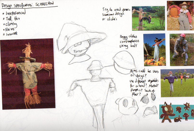
Again, I started just by looking very generally at some scarecrows. I really liked the one in the lower right corner; a great example of a simple but pretty refreshing take on the conventional scarecrow!


I toyed with the idea that maybe the scarecrow could look as if he was trying to be scary, perhaps by giving him long, thin and pointed fingers — perhaps they could even be made out of sticks?

Jazzy specified that the scarecrow should be tall and very thin to emphasize his clumsy nature — maybe we could give him big hands and feet to further suggest this? 

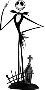
I was looking at some other tall, spindly characters as a point of reference —Jack Skellington in particular, as though he's a little different to what we're going for in terms of design his exaggeratedly thin limbs and a rather large, circular head are quite nice features for a scarecrow. I really liked how the eyes and mouth looked on Jack so I tried to incorporate something similar into some of the sketches.


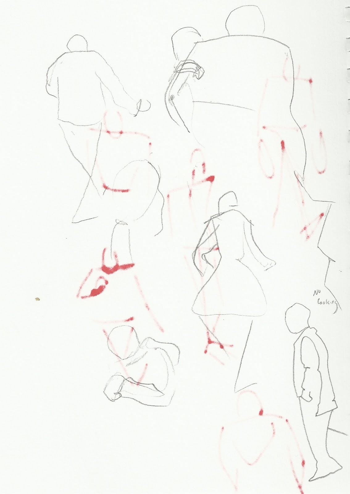
I was mostly just experimenting with body language and more head designs here; I wondered how a naive and slightly nervous character might hold himself, I thought perhaps with his feet turned inwards, but he just ended up looking really timid and anxious. 

A stocky design for the crow might work quite nicely with a scrawny scarecrow — the combination of tall/thin and short/stocky characters is quite prevalent in a lot of children's animation. Many notable cartoon duos have massively contrasting body structures:


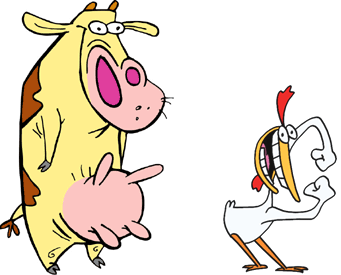
Radically different body structures in visual media where two or more main characters dominate the screen helps to create visual distinction and interest — strong silhouettes so that the characters remain recognisable in any given situation (at a distance, in the shadows, even in different costumes)

I thought this might be a nice idea to play around with and so experimented a little more with the idea of a short, fat crow:


I started trying to think more about character interaction at this stage — how the scarecrow might physically respond to the crow whenever it comes near him. Should it be outright terror, or is it more subtle? Is he merely uncomfortable around crows, or physically repulsed?

Was thinking about what sort of clothes he might wear and was slightly amused with the thought that, being a scarecrow, he just wore whatever leftover tat the owners had lying around — an outsized sweater, a lonely oven glove?

I'm going to focus more on actual scenarios and character interaction now, to try and really get to grips with the relationship and personalities of the two characters. Hopefully this will help me bring out more character in these drawings!

Design considerations: Crow

Well the pitch is over — let's not dwell on what did or didn't happen — I've been made producer as part of Group 7 with some most fabulous team mates, lead by our great director Jazzy. Our animation monkies executive animators are Sam (Bunce) and Jae (Hezhenyi). Very very pleased with this outcome and really excited to get started. If a bit nervous (what else is new?)

Jazzy's asked for us all to start sketching out some ideas in terms of character design and story progression, so that when time comes on Tuesday to begin scriptwriting we can cherry pick from everybody's work so that the final product is something that each of us feel we had a fair share of input on.

I've been scribbling both characters (the scarecrow and the crow), trying to come up with something interesting, and just figured I'd post up my progress (and the usual rambling reflection) so far.


The first stage in designing an interesting or strong character is, I feel, gaining an understanding of what it is that you're drawing. If your character is an anthropomorphic singing teapot, go and draw lots of teapots and start considering how you might anthropomorphise or physically characterise them! In this instance, the character's a crow, so I started on Google Images and started drawing a bunch of crows with varying success. Mostly none.

I had a great deal of difficulty in drawing the crows from reference. I can't simply sit down and copy what's in front of me — I find it very difficult to capture any sort of life that the original has if I don't understand why it's shaped like that or why it moves that way. As you can see from the drawings above I really wasn't into it — my crows looked more like seagulls!


So, for me, the next logical step was to take a look at some basic bird anatomy. I Googled a bunch of skeletons and a basic bird anatomy tutorial that explained the basic positions of limbs, construction of muscles etc. I don't feel there's a need to turn it into a biology lesson and learn the names of each underlying bone or muscle, but just knowing what's underneath the surface of what you're drawing — the construction and the basic mechanics — is amazingly helpful. 


As proof — look! My crows, I feel, improved noticeably almost instantly (except that one in the lower right corner — no idea what happened there). I'm certainly still no wildlife artist, but I feel that I understand where the legs were, the wings, why the back was that shape and why the head arcs like that. As a result the drawings came together much more easily. In cases where the subject is very dark in colour and you can't see a clear outline of the limbs, knowing that they're there and how they move allows you to make an informed estimation when drawing them. 

Enough self-centred bragging, on with the designs:


I now started considering how a crow's design might be simplified or caricatured. They have much larger beaks and very beady little eyes, so it made sense to try and exaggerate those features as part of the design. Jazzy said that the scarecrow should be tall and thin, so I thought it would be quite nice to have the crow short and stocky with a lot of rounded edges to create a bit of contrast. 


Still toying around with the short/round crow idea at this stage. I was playing around with constructing the body from different shapes to see how that would effect the silhouette and implied personality of the character. I think I was struggling a bit at this point — I find it tricky to portray the personality of a character without context. Static sketches like these always tend to be a bit lifeless and dull, but at this point I'm just trying to get a feel for how different shapes and bodies come across.


The other specification/suggestion Jazzy gave us for this crow is that she wanted it to be very subtly girlish, so that there was a kind of flirtatious implication between the two characters. Of course the first thought is always to just add eyelashes to it, but that tends to feel a bit shallow and too obvious. I messed around with the idea of adding rosy cheeks to it instead, which I thought might work quite nicely with the dark feathers?


More toying with body types. I'm really liking the idea of such a squat body with almost no limbs — I think it creates quite a nice silhouette and gives a lot of distinction to the character. 


I'm not terribly happy with the drawings I've done so far; they feel quite stiff and just generally lacking somewhere. I think that a lot of it is to do with context; as I said, I find it quite tricky to portray the character without it — I suppose these could just be seen as exercises to get going, to get a feel for shapes. I think the real character will start coming through and developing itself once we start building scenarios. 

Movement, Story & Structure: Three-act structure

Still pootling along and worrying my silly head off. Tried to start organizing my ideas into some kind of vaguely coherent mind map in the hopes that it might give me a better sense of direction with the whole thing: (s'why I like these blogs so much — helps me restructure my incoherent ramblings into something vaguely cohesive!)

Pretty much a summary of what I've covered so far in a more visually coherent manner. Toying with animal masks and the concept of emulating "desirable masculine qualities" in each of those animals?

Considering the ending, looking at 'Oozat' as a frame of reference. The trick is to keep it simple — Oozat isn't tremendously complex, after all, but it's so well executed and portrayed with such confidence. It really works. Sorry, that's my anxiety speaking again. I am rubbish.

I stumbled upon Marx's "character mask" theory whilst doing some research earlier today and I suppose I'm now beginning to really worry that my idea isn't sophisticated or clever or deep enough. I keep catching myself trying to shoehorn more meaning into it to make myself seem bigger, cleverer and more imaginative than I have any right to be at this stage — maybe I really am just worrying too much.

I've been toying with a slightly sillier ending, involving perhaps the main character (dressed as a lion) getting into a fight with somebody else (to gain dominance) — the girl, irritated, getting up from the bar and calling animal control or something. It's a bit less generic, but again, worried it has no strength.

Movement, Story & Structure: Animal costume research

I'm actually really quite liking the idea of dressing up/imitating animals to "attract" this girl, so I've been looking at some examples of animal behaviours/mating rituals. One of the more interesting ones is a bird that can moonwalk!

I think there's a lot of fun that could be had here — an endless amount of animals with bizarre or hilarious behaviours he could emulate.

Movement, Story & Structure: Finalising the story/thinking about the pitch

I'm trying to really dig into my idea so far and bulk it out so that it stands up — I don't know if I'm thinking about it too much or trying to overcomplicate things, but it seems that the more questions I answer the more I start worrying!

Trying to condense it down:

The story is about identity. Many of us project different identities or aspects of ourselves to others, depending on what we're trying to achieve or communicate. We may dress up to make ourselves look big and impressive to a potential employer. We often feel we get a fairly good impression of a person based on what they're projecting — the mask that they wear. Conversely, there are things about ourselves or others that we make every effort not to project, things about a person you can't read based on their physical appearance, things that can completely jeopardise our attempts at communicating with that person. 

In this a story, a man attempts to communicate his interest to and subsequently impress a young lady he has seen. He dons a number of extravagant masks and costumes, projecting desirable qualities in an attempt to impress her, but she fails to take notice. Eventually he removes his costumes and stands there as he is — showing his true face for the first time. She appears to acknowledge him and he prepares to embrace her — but she walks right past, hugs and leaves with another girl who has just entered. It's left ambiguous as to their relationship — friends, lovers, family?

I think I have a fairly stable concept, it's just the execution of the story that I'm a bit flaky about — mainly the ending.

I'm thinking that a lot of the meaning could be conveyed through colour — he is so wrapped up in himself and his own insecurities that he fails to "read" her — his costumes/personas could be very bold and colourful in contrast to the drab scenery. She could perhaps be black and white, very sparsely detailed, representing his lack of interest or consideration of her. 


This is a really weird comparison but I think of peacocks (or any bird/mammal, really) trying to attract a mate — they make themselves attractive, or big and impressive. His "personas," masks or costumes could be based on animals, displaying what he considers "desirable" traits? Beauty, power, etc... 

When he displays himself without the mask at the end, the first time we see his face, he could be black and white and low detail as well. When the two girls embrace they could become colourful — I thought they could maybe turn into birds, but that seems silly. Not too sure so far!

Movement, Story & Structure: finalising a story idea/concept

Inspiration has struck at an ungodly hour and I think I may finally have something I can work with!

I was thinking about a number of different situations in which people may exaggerate or project certain aspects of their personalities, and I resorted to an old clichĂ© — "man tries to impress a girl, but she's not interested."

I'm a bit stuck for the ending — I don't want to overcomplicate it, maybe just have her get up and leave with somebody else — but I don't know if that's too generic? She would ignore his advances and he would resort to more and more extravagant means to attract attention, to no avail — he would grow frustrated and paranoid — "I'm just not good enough!" rather than considering that, instead of being about him and "not being good enough," it could be something about her — there are certain things about people you are unable to ascertain by physical appearance. Things that can jeopardise our attempts to communicate, or that stand in the way of getting what we want.

I had a bit of a vision of the closing scene in my mind —


Maybe the guy is standing there, revealing his true face for the first time — she's looking at him (first person). We see the door crack open behind him, and she stands up, as if acknowledging him, he moves forward to hug her, but she just goes straight past him and embraces the figure who has just entered. He stands there, dejected, before slumping into his seat. View cuts to the front again, we see the two of them leaving together.

Might be interesting if they were both girls? Leave the relationship between them ambiguous — could just be friends, family, lovers?

I'm a bit shaky on it, I don't know.

Movement, Story & Structure: Developing the 'identity' idea

I've been exploring the idea of masks more and more, trying to develop a simple scenario in which emotional baggage could cause conflict. My initial thoughts, as suggested by members of the brainstorming groups, was to simply portray a number of family arguments perhaps caused by physical conflict of the gigantic mask bags they lug around with them. Perhaps a wife is trying to wash up with her bag beside her, her husband hauls his onto the worktop and breaks a plate, a fight breaks out, a cat steals a mask — that kind of thing. I didn't feel it was strong enough though — there wasn't so much of a meaning I could try to express. It just felt to me like a family wearing a bunch of masks and arguing.

I also tried toying with the idea of the businessman again — perhaps he's stopped taking his 'work face' off at home and his wife is sick of it. There could be pictures on the walls of happier times as she remembers the man he used to be? Again, though, quite a generic message and I was having difficulty deciding how to portray it visually.

I started toying with the idea that the masks don't have to be conventional masks at all — they don't even have to be human. Masks have always been thought of or used to disguise one's true intentions or identity, often so they fit in with another crowd —

Masks contain complete social schemas. Others look at the mask and understand what it represents and know what mask to wear themselves. [...] Masks thus protect the person and facilitate interaction with others. I wear a mask in different situations to be the person I want to be there.

— http://changingminds.org/explanations/identity/masks.htm

Pretty much what I wanted to express. People project themselves differently depending on who they're with or what they want. A good example might be primary school where you get students segregated into clusters — anybody that doesn't slot into any of those groups is usually picked on. I've always thought of school kids as packs of animals or wolves — I thought that might make a nice metaphor? Wearing wolf or sheep masks?


I had a brief spark of an idea involving a kid being chased through the playground by a pack of 'wolves,' carrying his huge sack of identities, and trying to hide amongst the other 'animals' — but I didn't get very far with it. I think I'm straying too far from the original concept. I need to revert back to the 'domestic' concept. I'm just over-tired and in no fit state to think clearly. I've had a look at quite a bit of reference material, maybe I just need to take a step back and let it sink in?

Mr Stache

OK, this one's a bit sillier and it's not animation but it made me chuckle and it's quite a nice take on the theme of identity:


It was created from a very bizarre pitch received in a competition, in which a guy, staring deadpan into the camera, describes a "very serious drama about a guy who grows a mustache and everybody hates his mustache and he's sad because everyone hates his mustache." All's well, though, as our hero eventually finds acceptance in a girl… with a mustache.

It's totally silly but actually quite a refreshing look at the whole thing. Again, an example of a relatively simple concept executed with a bit more depth. It's quite dialogue-heavy, though that tends to be more for comedy value rather than story progression. I'd imagine you could tell a very similar story with no dialogue at all.

Café Bar

Another one from British Animation Classics — CafĂ© Bar by Alison de Vere.


I'm really liking the style — the inclusion of a mask is an added bonus — using colours to emphasise all the important or dreamlike segments, a ray of excitement in an otherwise bland existence, establishing false identities before finding acceptance in the mundane and regularity of everyday life.

The scene in the beginning where the man takes off his beard and glasses also got me questioning my use of masks and whether they have to be masks at all — could they not be props or costumes used to project a different identity? What if they weren't human masks? I think the biggest issue at the moment is that I'm trying to make a concept around a film rather than a film around a concept, causing me a bit of difficulty in actually progressing. It feels a bit like I'm creating symbols with nothing to actually symbolise. I think what I need is to take a few steps back and try to come up with a solid concept or theme. If I can summarise my intention — the message of the film — concisely in one sentence then it might be easier to start fitting the rest of the pieces into place.

'Oozat'

Had an absolutely terrible time of it this afternoon, I don't know if my brain was just fried or what but I just could not get anywhere. I couldn't seem to hold an image in my brain — I've got a real headache now. And snow blindness from staring at a blank page.

Managed to get my hands on a copy of 'Oozat' though — featured on the British Animation Classics Volume 2 DVD. I had to watch it a couple of times to really 'get it' — it's actually pretty straightforward but I think I tried to over-analyse it the first time, looking too hard for some kind of deep and hidden meaning. I'm always afraid of seeming stupid so I tend to try too hard to 'get' things rather than taking them at face value. Sorry, rambling again! Melty brain no work good.


Anywho, there's a really imaginative use of masks here. I found it interesting how they were used to show expression and identity rather than conceal it — something I'd never considered before!


I was fairly surprised how close it was to my original idea — having the confusion with constantly switching identities rapidly is perfectly captured here and it's kept very simple with only a few characters. I tend to think too much about the larger mechanics of things and sometimes find it difficult to boil it down, so this is a very useful reference. It shows that you really don't need to go overboard with detail — you can summarise potentially complex relationships very quickly with only a few characters. Certainly something to bear in mind.

It's not really related but there was another great short I came across on the DVD — Manipulated by Daniel Greaves (also ex-Farnham!)


It's an absolutely fantastic piece of animation. Demonstrating an animator just having a bit of fun, with an astounding result. I think I've seen something similar before but I don't remember what it was called or who made it (how helpful) but it involved the animator interacting with a rabbit-like character? Always loved these kinds of animation — pure body language and character oozing from every orifice.

Movement, Story & Structure: 2nd brainstorming session & ideas feedback

Yet another intensive day (thinking hurts)! We had to present our three most robust ideas for feedback and decide on one to develop further in preparation for the pitch next Tuesday.

My three presented ideas were... varying in overall quality, I suppose is the diplomatic way to put it, two centring around identity and the last related to phobias.

My first idea I was initially quite keen on, as previously described I wanted to animate to a recorded interview — similar Aardman's 'Creature Comforts' shorts:

It's a great example of how the best comedy or the best ideas simply come from everyday life and conversation — people say the strangest things and sometimes just shifting the context can make such comments hilarious, poignant or even just depressing. Very witty use of characters and subject displacement — something as simple as a piranha with a toothache works really well. I suppose this is something I'd been hoping I might be able to emulate as well — but in hindsight it's a very different subject and it probably wouldn't have lead to the desired result.

I was thinking of asking people to describe a type of person, group of people or subculture and have the character be built, come to life and change in accordance with the given description. I thought this could have been pretty interesting but it was problematic in that I would have been very limited to what information I could get from interviews. The idea would depend almost entirely from what was given to me — it would have been difficult to plan and schedule for it, and even (as Andy suggested) trying to gently engineer the interviews to give the desired results would have been tricky.

The second idea was the one with the masks; Andy did note that it was the third mask idea he'd heard that day but wasn't terribly surprised as, with four fairly standard themes, common ideas were bound to occur. It is, after all, how you approach and present the idea that's most important. He liked my suggestion of a big bag of masks, being awkward to carry around, representing emotional baggage, and suggested that I condensed the idea down to a simple domestic situation with conflict caused by or involving this baggage, as opposed to having a big long tale of a man getting up, going to work and encountering lots of people. He mentioned I should look at the way Darren Walsh used masks in his graduate film 'Oozat' — so I'll be having a poke around for that.

The third idea was quite similar to the first in terms of execution. Rather than interviewing, I was thinking of simply having some sort of recorded voiceover giving a (fictitious) account of something that had happened to them — a typically 'adult' worry such as debt, redundancy, or some other difficulty but animating that as a child might understand it. I was intending to represent the idea that as we grow older, fears and phobias are commonly seen as something 'childish' or as a sign of weakness — by illustrating them from the innocent perspective of a child I'd hoped to suggest that we are all reduced to a childlike state in the face of fear or danger. The biggest problem with this though is that I wouldn't be writing something that I knew — having never experienced something like severe debt (for example) I'd probably end up giving a very shallow portrayal. I did have some things in my head that I thought could have worked fairly nicely — representing 'debt' (or whatever) as a big, scribbled monster destroying a house as the voiceover described how their family and home was lost — but, ultimately, I do completely agree and it wasn't an idea I felt was really 'working' for me.

I think I'll be sticking with my second idea. The tricky part is going to be coming up with a relatively simple set up and conflict with enough legs to work with. I've been toying around with different settings — an argument over breakfast, washing the dishes, a pub — but nothing's really been sparking my imagination so far. Hopefully a quick break will help!

'The Itch of the Golden Nit'

http://www.bbc.co.uk/news/uk-england-london-13298320

Interesting example of children's illustrations used in animation — this could be an interesting technique to use in contrast to some quite 'adult' phobias, such as debt, redundancy or getting old.

Phobias are often seen as something quite childish and even a sign of weakness — animating with contrastingly simplistic and childish drawings could represent the perceived innocence of fear, the idea that even the strongest and most authoritative of us are reduced to 'children' in the face of fear.

Electro-Phobia


Really nice little animation I just found on Youtube... super-simple story, just over a minute long, in which a pint-size criminal spends the days leading to his impending execution avoiding everything electrical. I especially love the shower scene.

It's a simple idea but quite well executed! It brings to mind other situations in which you can play around with characters and unfortunate circumstances or conflicting situations — perhaps a vet that's afraid of dogs or a bird that's afraid of heights. The tricky part is keeping it simple and fitting it into a narrative...

Movement, Story & Structure: Post-briefing and initial thoughts

Straight into the new project and had a pretty intense brainstorming session. I managed to weedle out a few ideas that seem to have legs of some description, but generating ideas is very often a tricky process. I suppose the problem so far is that I'm too concerned with finding a "good" idea and am censoring myself too much, worrying that "this is stupid" or "that won't work."

We were given a set of four themes/working titles to play around with, all of which are broad enough to allow us creative freedom to do pretty much whatever we like but still providing us a good starting point:
  • Fears/phobias
  • A moment in time
  • Memory
  • Identity
  • A commercial
I found a commercial and a moment in time to be the trickiest. It seems that so far I'm attracted more to "identity" — I've always had a great interest in people, the ways in which they behave and why. I just love watching the way they interact with each other and figuring out exactly what makes them individual.

We've got to have at least three solid/robust ideas by tomorrow, ready to select one to roll with in preparation for (gulp) the big pitch next Tuesday. I'm a little apprehensive — how robust is robust? How fleshed out does it have to be? I suppose I can only do my best and just need to push my ideas as far as I can.

So far, the ideas that have really stood out to me amongst my masses of indecipherable scribblings have revolved around the identity theme, though I did have a vague sort of concept for phobias as well.

For the first, I was thinking of interviewing some people and asking them to describe a type of person — an old man, for example — and as they're describing his physical appearance he begins to be built on-screen (this could be using a multitude of techniques, such as drawing or collage from photographs) — and then as they proceed to describe his personality he begins to move to reflect that. For example "they're usually really slow and grumpy and are really rude!" This could also potentially introduce interactions with other characters (built in the same way) — e.g. "they hate young people." It would basically be examining the how different people perceive the same groups or individuals, etc. Kind of similar to Aardman's "Creature Comforts," in which a number of interviews with regular people on a variety of topics (doctors, housing, etc) are animated to using animal characters.

The second idea was more of a "conventional" narrative, about a man who works a very serious office job and has a number of cardboard "masks" he wears (each with a different face or expression) to suit a different social purpose — for example, one for work, one for his family, one for greeting a friend on the street, one for drinking with mates. Everybody in the world has a number of different personas or identities that they rapidly switch between to suit different purposes — a boy trying to pull an attractive girl will behave much differently than when he is with his family, for example. I was imagining the character repeatedly encountering different people throughout the course of his day and needing to change his mask to accomodate each situation.

The third idea was very similar to the first — again, involving interviews, this time asking children what they are afraid of/what frightens them most. It could be quite interesting to animate to this soundtrack using very child-like drawings. I'm really not sure about this one. It could be interesting but I don't feel it has as much weight as the other two?

I'm going to sit down and have a closer look at them though, see if I can pull them together more solidly. 

Animation practice: walk cycle V2 [clean]

Annnnd here's the clean version. Less clean/refined than the previous cycle, owing mainly to the fact that I made all corrections to the arms on the new "clean" layer, but there you go. Rather less pleased with this one than the last but it's quicker and more careless, so I'm not too upset about it. It's really just me playing around, trying to keep fresh, doing different things, etc. etc.

I seem to have a morbid fear of heads — again, he loses it in a few frames.

Comic: 28/01/2012


More comic fun. Honestly, mainly just an excuse to draw a skull! Nice to see my anatomy study from last summer paid off — cross-checked my drawing against a reference at the end and was pleasantly surprised to see that I'd kept (mostly) everything in the right place.

Again, that's supposed to be Jazzy... at least she looks vaguely human this time around!... (and not Amish) I suppose that, with hindsight, it's easier to caricature yourself. You don't need to worry about being too honest — though having said that I think I draw myself far too flatteringly. Need to up the ugliness ratio a touch!

I seem to be running out of things to say about these comics. Maybe that's a sign I'm not doing enough differently?

Animation practice: walk cycle V2

Another walk cycle, did this one pretty quickly and pretty much just made it up as I went along which explains why it's a bit squiffy. I think I've pretty much got a good grasp on leg movements now but I still seem to be having difficulty with the arms — practice makes perfect as they say! Going to try and fix the arms slightly on this one — there's a bit of a jump as he brings them forward and they extend to the furthest point too quickly so they're kind of delayed too long at the front... I know what I mean!

Comic: 27/01/2012

I'm going to consider this one an exercise in patience and consistency. Drawing the same thing consecutively and keeping it looking the same without going insane and taking 14 million hours. I'm trying to train myself to draw quickly and accurately — a useful skill to have at any rate, but also because I'm an impatient little sod.

Animation practice: walk cycle V1 [clean]


Made some slight corrections to the arm! I think it's a bit better now but I'm not entirely satisfied; it seems, to me, as if it goes back too far. If it went back a little less I could possibly have delayed it at its furthest point for just a little longer which would probably have looked better, but hey ho!

I also did a very quick cleaned up version:


I'm actually surprised by how it turned out — looks better than I thought it would! I forgot the head in some frames, because I am a big stupid face. The arms look a lot better in the clean version but I'm not at all sure why — I didn't change them at all?

Still, it was great practice and I feel that — looking at this compared to my early cycles — I've actually made some sort of progress and, dare I say it, I may even begin to be getting the hang of walk cycles. Which is a nice feeling. Let's hope it lasts...

Comic: 26/01/2012


Lots of exciting first person views here.

Significantly hastier and more sloppy comic; but at least it's remaining quite clean! I'm still not entirely sure why somebody was compelled to actually post me a box of beans. They're either having a laugh or they know me very well.

Comic: 25/01/2012


Chronicling the exciting events which led to the destruction of my phone. This is completely accurate and not at all exaggerated.

Rather more pleased with this one in terms of visuals (with the exception of the last panel where everything seems to fall apart) — it didn't take me too long, it's relatively neat and the people look at least remotely human! Still need to work a lot on expressions and posing but I think I'm making progress. I'm finding these comics are a really useful exercise — taking mundane events and characters and just turning them into ideas. I'm hoping it will be beneficial in terms of developing narrative in the future.

Animation practice: walk cycle V1 [with inbetweens]


Lazily working away on this. Got the inbetweens done; think I'm mostly happy with the legs at this point, but the arms could use some further tweaking. Need to delay them slightly so there's a bit more of a pause before he brings them forward. I think it's too fast as well; 24 frames on 1s. It just seems really really quick to my eye, though I could just be used to shooting on 2s after AP?!

I always seem to mess up on the keyframes as well, never spacing the limbs far enough apart so that there's no room for movement when it comes to inbetweens. I think it's because I don't consider the timing enough — I tend to forget I'm doing keyframes sometimes so I start animating the limbs so they're nice and smooth... then realise, oh shit, I still need to inbetween this.

Er. That all made sense in my head. COMIC TIME, BYE.

Animation practice: walk cycle V1

I'm still really lacking in confidence when it comes to walk cycles, so I thought I'd do some more playing around!


Only keyframes thus far. It's pretty simple but it seems to be mostly working. I need to adjust the arms very slightly and the hips need more of a defined arc, but it's getting there... I think!

Gotten a bit behind with the comics; planning on finishing them up this afternoon after I'm done playing around with this.

Sketchbook: 23/01/2012 and a quick animation test-thing

I barely got anything done today. It seems that somewhere between tidying my room, going shopping, arguing with the pharmacy and trying to fix my phone that the day has drifted away. I just wish I didn't feel like such a failure every time this happens. It's just one day and I don't have anything pressingly imminent to have achieved, but I feel like I've wasted my time and that I've let myself down. I that, unless I'm eating or sleeping, I should be working all the time, or else I'm not working hard enough. This makes me feel like crap, which causes me to do even less. It's a vicious hate spiral.

Bleh. Anyway. Things!


Wanting to do some quick experiments/tests/practice animations just to start getting back into the swing of things, so I thought that I might try doing a short sequence of somebody waiting for a bus, or something... for some reason. I filmed myself for reference and to get some basic ideas, kinda came up with a guy leaning on the wall, drumming his fingers and looking around. He straightens up, puts his hands in his pockets and swings from side-to-side a bit, before checking his watch and throwing his arms down in impatience. Looks very nice in my head, but in reality this is all I ended up with:


Again I demonstrate my complete inability to finish anything.

It's barely more than keyframes and some really shoddy inbetweens right now. It's a bit scruffy and terribly lazy, with some obvious problems — not too pleased with the standing up (think he needs to move his weight forward a bit more before straightening) and there's a kink in the swinging where he goes back and then suddenly forward then back again. I think there needs to be more of a pause as he looks at his watch, and I'd like the arms to have a bit more weight as he drops them, maybe sag his shoulders a bit more to emphasize his frustration. I think the looking up/back just before the watch check is a bit fast too, bit lifeless.

I don't know if I'll keep tweaking it. I'm going to maintain that it was just a loose exercise, nothing too serious, just something to freshen up — but I need to start dedicating myself to these little practices. It's a good habit to get into and I need to work on my attention span/focus. I get distracted too easily.

Sketchbook: 24/01/2012

Drawings from yesterday, first three sat in the cafeteria and the last one in the lecture theatre just before the animation awards screening.


Not much to reflect or comment here I'm afraid, but it's worth noting that yesterday seemed to be quite a good day. I didn't even think twice about getting my sketchbook out and it didn't feel forced at all. It probably sounds really pretentious but it felt perfectly natural and really nice. I wasn't worrying excessively or anything. Doesn't mean the drawings are any good of course, but it was a nice feeling and I hope that it's a good sign of things to come. I suppose I'm only really mentioning it to remind myself that sometimes, things go well. :]

Comic: 24/01/2012


Simple comic for today — look and me being all topical! Taken a couple of steps backwards in terms of neatness — it's sketchy and messy again but it's the animation awards this evening and I'm all excitable and can't sit still. That's my excuse and I'm sticking to it!

Having a little more fun with things this time. Trying to loosen my representations of people — it still looks nothing like me (my eyebrows are nowhere near that cool) but, for me, it's just about trying to loosen up.


Yes, I read The Sun.

Comic: 23/01/2012

Feeling slightly better today (thank God)

Sorry... eraser peelings everywhere! Forgot to brush them off. Me stupid. Will re-scan later!

I took a bit more time over this one and it kind of shows (aside from aforementioned eraser leavings)? Still messy and that looks nothing like my dog at all but I'm thinking that I might try another tactic for cleaning it up. Rather than inking directly over the original pencils, which I would imagine fills most people with terror in case they mess up, I'm probably going to just scan or photocopy it, make the sketch blue, re-print and then ink over the copy. At least then I might be a bit more relaxed. Used to do it in ye olde days when I drew for fun and it got some quite nice results.

Our dog is horrible and she smells.

Comic: 22/01/2012


I'm feeling like a massive failure today. I'm sorry, I don't mean for this to get too personal.

(But hey, look! Clean lines.)

Sketchbook: 22/01/2012


Just some more sketches from today. Really not feeling it; had difficulty concentrating. Tried in vain to use only one line, tried using Mr big red pen to keep things loose but it just wasn't working out. I think I'm over-tired.

Comic: 21/01/2012

I'm having a really, really bad day today. All I drew was a generic and really terrible angst comic. It's not particularly dark or disturbing or anything, it's just embarrassing and pointless and I'm not entirely sure I want to post it. But I feel like I should, if only for documentation purposes.

I don't know.

Sketchbook: 21/01/2012

Seem to be having a bit of an off day... I'll be lucky if I can get one decent drawing out.

More practice with poses and gestures - I used the random pose viewer on http://www.posemaniacs.com for reference. I tried to draw all of the ones it gave me but it seems to be quite fond of giving you all sorts of weird perspectives and angles that, quite honestly, I wasn't feeling up to tackling.


I don't know what on earth was wrong with me today. I just found that my mind kept wandering and I found it very, very difficult to keep looking at the model as I drew. I suppose most of it's discipline. As noted in my life drawing feedback I have a tendency to be a bit generalised and, when my eye wanders from the model, I tend to 'invent' a lot of things. It's all due to lack of observation on my part. I just need to be stricter with myself and keep drawing with my eye locked on the model. I think I'm just a bit too timid - I'm terrified of getting it 'wrong,' and so by constantly looking at the paper I can make sure I'm drawing something 'good.' Not looking at my paper kind of removes that element of control and leaves me vulnerable to failure, or producing something 'bad.' I just need to work on my fear and stop being so self-conscious about everything.