Walk cycle 9, take 2


Update on the previous walk cycle. It's still messy and lacking in consistent volume but I've added most of the inbetweens at this point. I tried to animate intuitively rather than mechanically, adding inbetweens where I felt they needed to go rather than placing them formulaically where they should go. I'm not entirely satisfied yet — the arm in front lags a bit when it comes forward, so I need to have another look at that.

I think the previous jerkiness was caused by the up position rather than frames being misaligned (though that was certainly a factor). He kind of lurches forward too far and sticks his neck out which causes a bit of a jump. I redrew it slightly so his body was straighter and his head and neck were less stretched. It looks a bit better now but there's still a bit of a jerk in there but I can't figure out what's causing it. Hopefully coming back to it with fresh eyes after some sleep will help!

Once I've got the movement as fluid as I can I'll work on cleaning up the lines and fixing the problems with volumes.

Ninth walk cycle attempt

I finally realised what was wrong. Not just with the walk cycles, but with everything. Disregarding the fact that ball bounces are generally more straightforward, I'd just been really struggling to get a grip on walk cycles. It's a bit hard to explain but I've just been feeling like I was missing something. The inbetweens just weren't coming together and I really didn't know why I couldn't grasp it. It's a relatively simple concept, so am I just stupid?

Then I had a bit of an epiphany. It's arcs. I've not been basing them on arcs of movement. I've always been aware of the idea that all movement is based on arcs, but I never really thought about it until now. It's nice though, I feel as if the penny has finally dropped and I'm excited!


Okay, so it looks terrible so far, but all the while I was working, everything made sense, and that's what excites me. It's currently way too fast, so I need to add a few more inbetweens to cushion it out a bit. The frames aren't really aligned properly, so it's a bit jerky as well.

I did a number of things differently this time 'round. To work out the inbetweens I flipped back and forth between the two keyframes and marked out with a small X where certain parts of the body (e.g. elbows, knees, heels) were on each keyframe. I was then able to see the arc between the two points, allowing me to plot each inbetween far more accurately. I really concentrated on leading the feet with the heels to give them more life. I think it looks better so far but I need to tweak it so the heel strikes the ground more directly.

The ridiculous arm swing was my attempt at making the arms a bit looser. Rather than having the lower arms follow the path of the swing exactly, I tried to have them flick upwards as they started to swing backwards... as you can see I ended up taking it a bit too far! He looks a bit of a prat but I've found it syncs quite well with Billie Jean by Michael Jackson...

I'd already drawn out the keyframes before thinking in terms of arcs so I was kind of saddled with flawed poses to begin with, making getting decent inbetweens almost impossible. If I'd started from scratch and really worked out the mechanics of each keyframe beforehand I think it may have come out much better. But it's a start. I think that once I've cleaned it up a bit and finished off the inbetweens it might be quite nice as a character walk.

Eighth walk cycle attempt

Revisiting the walk cycles again to see if I can tighten them up any more! I've not got access to a light box this weekend but I didn't want to let that stop me from doing anything, so I pulled the frames from my sixth attempt and traced 'em in Photoshop to see if I could tweak the arms and legs a little more.


I still can't seem to get this right. I fixed some slight volume problems in the arms and tried to have the shoulders move back and forth to give the impression that the body was twisting. I think it looks better but it's still way too stiff and robotic — I can't figure out exactly why but I think it may be because it's such an exaggerated walk and it doesn't really work on a 24 frame cycle; it should probably be faster and more lively. I think the upper body is too static as well — it's constantly held upright despite the extreme drop into the down position. If I were to squash or bend or otherwise have the body react as he drops and rises it might help to make it feel more "alive."

Sketchbook: Shoot me again (re-do)

Andy gave me some great feedback on my lip syncs so far and suggested that my "shoot me again" was a little at odds with the sarcastic tone of the dialogue, so I'm having a bit of a crack at re-doing it to better reflect that. Rather than moving forwards, he suggested that the character should pull back.
Click for full size
Sarcasm is quite a tricky expression to convey in any case, but it's even worse when your character doesn't have eyebrows! You don't quite realise how much dimension they add to a character's face until you remove them.

I had a shot at drawing some 'regular' expressions first, before attempting to translate them onto my character's significantly more simplified features. I've always felt that the aim of animation, and indeed drawing in general, is to convey as much information with as few lines as possible. You need to make each and every line count — if it's not contributing anything to the expression, remove it!

Also trying to pin down his body language at this stage — I want him to shift his body weight backwards, shoulders and arms up in an almost defensive shrug. "Shoot me again — I enjoy it!" I'm having some trouble getting the balance right.
Click for full view
So far I've not liked the way that adding eyebrows completely changes the structure of my character's face, so I'm leaning towards keeping them off. I'm trying to figure out a way of shaping his eyes to suggest the existence of eyebrows. I'm finding it quite difficult, though I think the inclusion of his lower eyelid into the expression helped a lot.

I still need to really pin down the expression and body language. I don't think it'll do too much good to keep working on them entirely separately. I need to start trying to combine them properly to see how they work together.

Finest wines — version 4

Working on this one a little more. I tried to fix the mouth on "we want the finest wines[...]" and I think it looks a bit better, but it's way too fast. It's quite a complicated sentence and I'm finding it difficult to figure out where to put each keyframe, which sounds to stress and for how long. I think the last part syncs up a little better now though.

Not too pleased with the gestures and facial expressions either. Seems a bit artificial and stiff and doesn't have much personality. I can't put my finger on what it is. He's a bit tipsy so he should probably have some spontaneous eye spasms or tilt his body about a bit more or something. He wasn't a particularly impressive character to begin with but he doesn't seem to have quite as much character as my pencil drawings. That's the only problem with Flash, it can tend to make things a bit 'clean.'

Acting workshops — day 1

We had our first acting workshop today. It was great fun, though it's not the kind of thing I'm normally too comfortable participating in; I am by nature a fairly timid person and tend to sit back and observe rather than join in. There are so many big personalities in the room and I think I find it a bit difficult, or perhaps intimidating, to "live up to" that (for want of a better term!). Still, I certainly had a go at it and I think it did me the world of good (though it looks like a career in acting is well out of the window)


Though I didn't get into the roles nearly as well as many others did, I still feel I learned a great deal simply from observing the others. During one exercise we were split into two halves and lined up in height order. The first group would then walk around the room, following the person in front and imitating their walk, posture, mannerisms etc. That person would then move to the back of the line and the next person would take over, and so on. I found it surprisingly difficult to observe the gait of the person in front whilst actually following them — it wasn't until our group stepped back and watched the others that I was able to really notice things like shifts in weight (some walked with weight on their legs or knees, others with hips, etc) and leading body parts. It's also surprisingly difficult to walk like yourself when you're aware of people following and copying you! It's quite interesting how aware (and sometimes even self-conscious) of your own movements you become — until watching some of the others, I didn't realise that I actually walk very quickly. I feel that, after today alone, I'm already more able to easily identify not just the way that people are moving, but how and why they're moving like that. Where is the weight? Which body part is leading?


Overall though it was great fun — the entire room was an explosion of personality and it really made me realise what a great group we've got this year. I'm really looking forward to next week — hopefully I won't be such a bucket of nerves!

Finest wines — version 3

I did a little more forward planning on the "finest wines" lip sync in the hopes that it might make things a bit easier. I really struggled to come up with a character design initially and experimented with something not human, as I thought that a less complex figure might be easier to exaggerrate.  
Click for full size
Click for full size


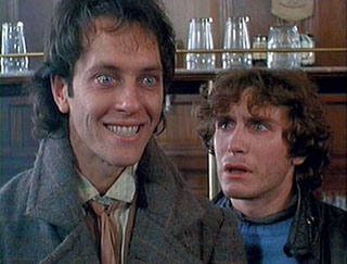
They all felt too stiff and uninspired as you can probably see. I couldn't picture any of them with the voice in the clip, so I ended up looking at some photos of Richard E. Grant [the actor to whom the voice clip belongs] for some inspiration. The character he plays in the film, Withnail, is a washed-up, drunken actor, so I felt it would be appropriate to try and capture some of that scruffiness.

Withnail is such a dirty character with a multitude of hilarious expressions. It's all in his twisted, gurning mouth and heavily shadowed features. I'm not entirely sure if I'd be able to replicate the sheer genius of his face!
Click for full size
I ended up reverting to a human figure, partly because it was easier; all my planning so far has been using a decidedly human-shaped stick man so it would be a bit more difficult to go back and re-animate everything to accommodate a completely different body shape.

I'm much happier with this design. It's simple enough to animate but with enough hlittle details that I can have some real fun with — knocking his beer glass over, swaying his tie around, etc.


It's still early stages, but I'm mostly happy with the body movement now. It could use some tweaking here and there — the fist slam still bothers me. It's not a terribly aggressive voice in the clip though so I don't want to overblow it completely. I'm half thinking I should simply remove it and just have him drop his beer glass back down onto the table.

I also changed the hand that's holding the beer glass as I quite liked some of the gestures he could make with it.

The mouth is all over the shop and I'm not at all happy with it so far. It syncs fairly well at the end, but "BALLS" just doesn't look at all right to me. "We want the finest wines available to humanity" looks completely wrong as well. I think I just need to make each mouth shape a bit more distinguished and perhaps cut down on the amount of different shapes I'm using, see if I can squash some sounds together. I think his jaw needs to move up and down as well. I can sort of get away with having the mouth just move when he's facing the front, but from the side his jaw is more prominent so it needs to hinge up and down as he speaks.

Finest wines — version 2


Mucked around with this one a little more, not changed too much, mostly just playing with the fist slam at the end. It's still not quite right. I don't really know if it's working with the voice clip — it's not really angry enough for him to pound his fist on the table like that.

I'm going to have a look at getting some sort of character design roughed out so I can start tinkering with the mouth. 

The audio quality is still horrible... can't seem to figure out what's wrong with it!

Second more refined lip sync

Done a couple of little things today; refined my "Shoot me again!" lip sync a little more, cleaning up odd lines and making some further adjustments to the hair. I also tried Ron's suggestion of keeping the eyes facing the same way rather than rolling back in the head at the beginning, which I think looks a lot better!


It's still far from perfect — the head keeps changing shape/size and the hair wiggles about a bit weirdly at the beginning but otherwise I'm reasonably happy with it!

I started playing around a bit more with another sound clip this afternoon and making loose plans for another lip sync. I didn't do any forward planning and it really shows. I really just wanted to have a bit of fun and get to know Flash a bit more.

Ron suggested that we try animating the body and head movements first and then work the mouth around that — hence why there's no actual lip sync yet! I want to keep working with this one so I'm going to try and refine the movements a bit more, especially the fist slam at the end. It's a bit lifeless at the moment so I'm going to try and loosen it up a bit before getting a face on there.

I'm not quite sure why the audio quality is so bad, it sounds absolutely fine during playback in Flash, just seems to deteriorate whenever I export. Very strange!

Slightly more refined lip sync


Ron gave me some helpful feedback on my work so far, suggesting that I work on making the hair flap about a bit more. He also suggested that I add a few inbetweens to cushion the snap-back between "-JOY" and "it". I've added just one so far — I'm going to see if I can get in another to try and smooth it out a bit.

The hair movement's a bit choppy and there are still a lot of problems with volume and such, so I'll see if I can fix that up and refine it a little more.

Lip sync test, take 3

Third attempt. I'm a bit happier with this one!


It's still far from perfect; it seems to be moving a bit too quickly and I think there's too much going on with the eyes right at the beginning. There's too much movement in a short space of time and I don't think it really 'reads.' I tried to add a bit more life to the hair, making it flap around a bit — could certainly use more care and attention but I think it's getting there.

I also tried using a smear frame to make the "enJOY" part a bit more snappy which seemed to work much better than I thought it would. Overall I'm slightly more satisfied, but something still looks strange with the mouth — I can't really put my finger on it.

Lip sync test, take 2

Second attempt at a lip sync, this time messing with the character design a bit to try and make him a bit more interesting. 


I don't think it came out too well — I think I overcomplicated the design a bit which made it much harder to keep things consistent, leading to lots of problems with volume and shape. He looks like a totally different character by the end! I probably got a bit far ahead of myself and tried to do too much too soon.
I also found that the beak got in the way and made shaping the mouth much more difficult. I think I'll go back to the simplified design and try to smooth it out a bit before I start thinking about more complex characters.

Still, it's a start I suppose!

Some interesting lip sync examples


If you can look past how irritating Penny is, the Rescuers has some interesting little scenes that are heavily dialogue-based. Normally there's something of a rule of 'show, don't tell,' but the animators were careful enough to keep enough happening in the scene so it wasn't just two characters talking at each other. There's some great personality expression here — the emotions and movements are exaggerated without being too over the top or unbelievable. If you watch closely the lip sync really isn't completely accurate — often the character's mouths just kind of open and close in time with the words. This is especially apparent in the Jungle Book scene where Shere Khan uses a lot of 'Oo' words but his lips don't really purse at all.  It still reads very well, though — I guess the sight of Auntie Medusa peeling off her eyelashes is so gruesome that you don't really notice anything else!

The eyes show a great deal. They completely change shape to accommodate the lack of proper eyebrows but remain consistent in volume; so far I've found it difficult to get such flexibility and character in the face without distending it ridiculously. There's nothing wrong with that if done correctly, but so far my attempts have just come out looking stiff and lifeless. I think the problem is that I'm isolating them as their own shape, rather than considering their volume and how they affect the rest of the face.

Lip sync version 1 (unpolished)

First attempt at a lip sync! I apologise for the most uncreative selection of dialogue...


I basically just drafted out the vague mouth shapes on paper and whacked it all together in Flash just to see if my timing was right. There's absolutely no expression or emotion just yet and the mouth is all over the shop in terms of volume and consistency. I plan on doing something more exciting later, but I really just wanted to make sure it synced up correctly.

It doesn't really look quite right to me but I'm not entirely sure why. I'm worried I might be using too many shapes for each sound?

Seventh walk cycle attempt

Another walk cycle attempt, using a totally fresh character. I still can't get the hang of making the arms seem more flexible so I decided to try and incorporate their stiffness into a sort of march.

I was really excited all the time I was working on this and had real fun with it — it was nice to use what felt like a much looser character. Unfortunately it didn't come out quite as well as I'd hoped.


I don't think there's really enough bounce in the walk. The character's quite cartoony and looks as if he should have a lot of up-and-down movement to match the exaggerated swing of his arms. This one has a lot less frames, too — only 16 in total, counting inbetweens. This meant that it was easier to work on and plan out but the fluidity suffers for it.

Overall I don't think it's too bad, but it could really use some cleaning up and alterations to the up and down positions to make them more prominent.

Sixth walk cycle attempt


Slightly better than previous attempts — at least the arms move properly this time, but they still feel very stiff and very slow. I'm not entirely sure what I'm doing wrong here; I think it may be that, rather than just drawing the inbetweens with the frames pegged as normal, I try to line up the heads so they're at the same height. I thought that lining up the shoulders that way meant it would be easier to figure out the position of the arms, but it usually ends up comes out looking a bit squiffy. I guess it's because it doesn't take into account the shifting of the body and difference in height in each frame?

I think I'll try a totally different cycle next time as I can only learn so much by constantly tweaking the same one over and over.

Digital Animaton: Alice & Martin Provensen (textural/colour influence)

I've been looking a little more into Alice & Martin Provensen's work, discovering (to my delight) that that they did more than just bright, primary-coloured cutout work. I found a small selection of grittier images that use a much more toned-down palette which I think is much more in keeping with the fairytale theme I've been pursuing so far.
The cutouts as seen here are still very stylised and simplistic. The boy in the bed on the left, in particular, strikes me as very 'puppet-y'. It's very easy to imagine what he would look like in motion as an animated character.
The background elements are very softly coloured and almost always feature an outline. This is pretty interesting and something I hadn't initially noticed — not giving the characters an outline prevents them from merging into the background and becoming indecipherable. This is pretty well demonstrated in the image below:
The Provensens also did a lot of looser, sketchier work using very rough inks. Much like Arthur Rackham they seemed to use quite limited colour palettes, although I imagine this was a stylistic choice as opposed to technical necessity:
I love the gestural feeling of the drawings and all the textures. From the images above it looks like they may have used some sort of acrylic paint and watercolours with quite thick brushes. It seems as if they might have dabbed or stabbed as opposed to strokes with the brush. It almost has the feeling of a sponge painting.

I think it might be possible to replicate similar effects by almost carelessly overlapping paints. Clearly they weren't worried about staying inside the lines! I may experiment with loosely blocking out the general shapes with a colour wash (or even tea) in order to try and capture the instantaneous, gestural feel of the drawings.

Fifth walk cycle attempt

I went back again and rejiggled my last attempt, having a crack at fixing the arms. This time I made sure that the arms were further away from the body at the highest point of their swing to allow more space for inbetweens.


I quite like the up and down movement, but the arms are too stiff. The upper arm movement looks okay but the lower arms need to follow their own arc and 'flick' a bit as they swing back and forth — at the moment they follow the movement of the upper arm and so appear a bit stiff.

There's another kink in his arms that Ron suggested might be due to the first and last frames (where the cycle begins again) not quite lining up properly, so I'll go back and have a look at those to see if there's anything I can do to fix it. He also suggested a couple of oddities in the figure's front knee, the first where the foot slides back as the figure drops but the knee doesn't quite follow. There's also a point just before the passing position where the leg kicks backwards instead of coming forwards — I was getting pretty frustrated because I couldn't really see where I was going wrong so I'm really glad he was able to point these things out to me. Being able to actually do something about it is immensely satisfying!

Digital Skills: Backdrop experimentation

Been doing a bit of tinkering with Photoshop, taking some inspiration from the works of Lewitt-Him and Alice/Martin Provensen. I wanted to see whether I could produce a similar effect to their simplistic cutout style using digital techniques.

Click for larger view
Not altogether too happy with it. I'm fairly pleased with the trees and grass and general scenery, but I really lost my groove on the house, which came out horrendously. There was a lot of detail that was difficult to break down and I was starting to get really impatient with some technical issues (read: Photoshop throwing up an "unrecoverable error" at me every 10 minutes), so I ended up really rushing it!

I thought that having quite bold and simplistic backdrops could work quite well if I was to have quite detailed character puppets, helping to bring focus to the scene. I think the colours could stand to be a little more subdued. Though I used a relatively limited pallette it's almost quite garish and potentially distracting. Lowering the opacity might help as opposed to completely re-colouring the entire scene.


The image was quite simple (if a little time consuming) to create — the original image (above) was sourced from sxc.hu, a free stock image resource. Ordinarily, I would prefer to go out and source my own images to use, but for the purposes of a spontaneous experiment it didn't really seem worth a trip to Holland ;] Retrospectively I could have used almost any image but I thought I'd try and keep with the theme of the project!

First I applied a Poster Edges filter to the image. This was to darken existing contrast boundaries and help Photoshop detect the edges of each object in the image when it came to the selection process.
 I then increased the brightness and contrast very slightly — again, to help with edge detection.
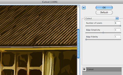
The cutout filter is one usually best avoided — in this instance, though, I found its use acceptable in order to help simplify the colours and shapes in the image, providing me a solid guideline to work from.
I then duplicated the background layer and applied a Find Edges filter to the copy. This gave a strong, distinct outline to everything in the image.
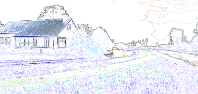


Unfortunately, in doing so, it also loses its colour information. Ideally I need the guidelines and the simplified colours/shapes from the previous layer, so I applied a Soft Light blend mode to remove the white from this layer and overlay it onto the one below.


The result is this fairly ugly but very useful image. It contains both the outlines from find edges and the simplified colours and shapes from the cutout filter, providing a perfect guide to paint over.


Because of the clear colour and edge distinction, I was able to simply use the magnetic lasso tool to make a loose selection around any area in the image. Photoshop was able to very accurately detect the edges of whatever I was selecting and mostly guided itself.
I could then just fill the selection with my chosen colour.