I found that I had a far more difficult time drawing the scarecrow than the crow; I'm not entirely sure why. I think it's mostly due to the fact that I don't 'know' him very well — I've not really spent enough time with him. It's one thing to know a character's personality but another matter entirely to truly understand what makes them tick. But, again, this is mostly shape experimentation — once I've got a feel for the shape of scarecrows I can begin trying to get inside his head and really work on bringing some life into him.
Just to clarify, obviously what I'm putting here is simply my own interpretation of the characters — I hope I don't come across as if I've totally dominated the design! I just thought it might be helpful to put these up and show how I approached the subject. :]
Again, I started just by looking very generally at some scarecrows. I really liked the one in the lower right corner; a great example of a simple but pretty refreshing take on the conventional scarecrow!
I toyed with the idea that maybe the scarecrow could look as if he was trying to be scary, perhaps by giving him long, thin and pointed fingers — perhaps they could even be made out of sticks?
Jazzy specified that the scarecrow should be tall and very thin to emphasize his clumsy nature — maybe we could give him big hands and feet to further suggest this?
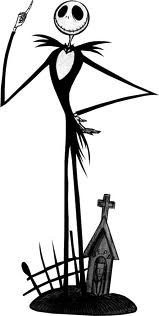
I was looking at some other tall, spindly characters as a point of reference —Jack Skellington in particular, as though he's a little different to what we're going for in terms of design his exaggeratedly thin limbs and a rather large, circular head are quite nice features for a scarecrow. I really liked how the eyes and mouth looked on Jack so I tried to incorporate something similar into some of the sketches.
I was mostly just experimenting with body language and more head designs here; I wondered how a naive and slightly nervous character might hold himself, I thought perhaps with his feet turned inwards, but he just ended up looking really timid and anxious.
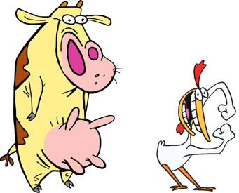
A stocky design for the crow might work quite nicely with a scrawny scarecrow — the combination of tall/thin and short/stocky characters is quite prevalent in a lot of children's animation. Many notable cartoon duos have massively contrasting body structures:
Radically different body structures in visual media where two or more main characters dominate the screen helps to create visual distinction and interest — strong silhouettes so that the characters remain recognisable in any given situation (at a distance, in the shadows, even in different costumes)
I thought this might be a nice idea to play around with and so experimented a little more with the idea of a short, fat crow:
I started trying to think more about character interaction at this stage — how the scarecrow might physically respond to the crow whenever it comes near him. Should it be outright terror, or is it more subtle? Is he merely uncomfortable around crows, or physically repulsed?
Was thinking about what sort of clothes he might wear and was slightly amused with the thought that, being a scarecrow, he just wore whatever leftover tat the owners had lying around — an outsized sweater, a lonely oven glove?
I'm going to focus more on actual scenarios and character interaction now, to try and really get to grips with the relationship and personalities of the two characters. Hopefully this will help me bring out more character in these drawings!


1 comments:
This looks really good Alex - you've done so much!
I like your character design for the scarecrow.
Post a Comment